📖 Day 7 – Summary: First Week
Data Visualization
On Day 7, I wrapped up Week 1: Python Basics by exploring one of the most important tools for financial analysis: data visualization. Plotting time series helps us understand asset trends, compare performance, and investigate correlations between returns.
Main Goals:
- Plot and compare multiple assets in one chart
- Visualize financial trends with normalized prices
- Compute and interpret correlations between returns
Step by Step
📍 Step 1: Created a simple line plot with random data as a warm-up;
📍 Step 2: Normalized prices (base 100) to fairly compare trends between IWM, GLD, and IGOV (last 90 days time series);
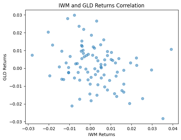
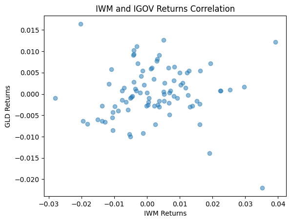
📍 Step 3: Computed daily returns, visualized correlations using scatter plots (IWM vs GLD, IWM vs IGOV)
📍 Step 4: Calculated the full correlation matrix with .corr().
Challenges / Insights
- Learned why normalization is key for comparing assets with different price scales.
- Saw visually that IWM and GLD are negatively correlated, while IGOV has a moderate correlation with GLD but very little with IWM.
- Realized scatter plots are a simple yet powerful tool to check linear relationships.
Code Snippet
```python

# Step 4: Daily Returns
daily_returns = data["Close"].pct_change().dropna()

# Step 5: IWM vs GLD correlation between 2 assets plot, and then IWM vs IGOV
plt.scatter(daily_returns["IWM"], daily_returns["GLD"], alpha=0.5)
plt.title("IWM and GLD Returns Correlation")
plt.xlabel("IWM Returns")
plt.ylabel("GLD Returns")
plt.show()

plt.scatter(daily_returns["IWM"], daily_returns["IGOV"], alpha=0.5)
plt.title("IWM and IGOV Returns Correlation")
plt.xlabel("IWM Returns")
plt.ylabel("GLD Returns")
plt.show()

# Step 6: Correlation Matrix Calculation
correlation = daily_returns.corr()
print(correlation)


```
Plots
Next Step
👉 With Week 1 complete, the next focus will be Week 2: Market Analysis Dashboard – Mini Project. Here, I’ll start combining my skills into a more structured application.